

How to Make a Venn Diagram in PowerPoint
12 min read
16 May 2025
By Aijaz Mughal
If you’ve ever struggled to explain how two or more ideas overlap or differ during a presentation, you’re not the only one to face it. Slides packed with text often confuse more than they clarify. That’s where learning how to make a Venn diagram in PowerPoint can make a real difference.
Venn diagrams visually break down relationships, making complex concepts easier to understand at a glance. Whether you’re comparing products, illustrating shared goals, or highlighting team responsibilities, a Venn diagram helps your audience grasp your message faster and more clearly.
And the best part?
PowerPoint makes it surprisingly easy to create one, if you know where to look.
In this guide, we’ll walk you through step-by-step ways to build sharp, effective Venn diagrams in PowerPoint that actually make sense to your audience.
What Is a Venn Diagram?
A Venn diagram is a simple visual tool made up of overlapping circles. Each circle represents a different group, idea, or category. Where the circles overlap, they show what those groups have in common. Where they don’t overlap, they highlight what’s unique to each group.
This makes Venn diagrams especially useful when you need to compare and contrast things clearly, like products, processes, opinions, or even teams. They’re commonly used in business presentations, classrooms, and reports to break down information in a way that’s easy to understand at a glance.
Whether you’re explaining similarities between competitors or shared goals between departments, a Venn diagram helps you communicate your point without overwhelming your audience.
Why Use a Venn Diagram in PowerPoint?
Adding a Venn diagram to your PowerPoint isn’t just about improving visual appeal; it’s a practical way to explain overlapping ideas and help your audience connect the dots. Whether you’re pitching a strategy, comparing services, or explaining research, knowing how to make a Venn diagram in PowerPoint can instantly boost the clarity of your message.
Here’s why using a PowerPoint Venn diagram works so well:
- It simplifies complex relationships by turning detailed information into easy-to-understand visuals using overlapping circles.
- It helps your audience stay focused by breaking up dense content with clear, eye-catching diagrams.
- It allows you to compare and contrast multiple concepts quickly, making your point stick without extra explanation.
- It adds a polished, thoughtful touch to your slides, making your work stand out, especially if you’re aiming for a more professional PPT design service.
Whether you’re creating a report, business pitch, or educational deck, choosing to create a Venn diagram in PowerPoint is a smart move for clearer, more engaging communication.
Methods to Create a Venn Diagram in PowerPoint
There’s more than one way to build a clear, visually appealing Venn diagram in PowerPoint, depending on how much flexibility or speed you need. PowerPoint gives you three effective options to get it done:
- Use SmartArt Graphics
- Create it manually with shapes
- Using pre-made templates
Method 1: Creating a Venn Diagram Using SmartArt
If you’re looking for a simple and time-saving way to create a Venn diagram in PowerPoint, SmartArt is your best starting point. It’s quick, beginner-friendly, and gives your slides a clean, professional look without needing design skills.
Here’s how to do it, step by step:
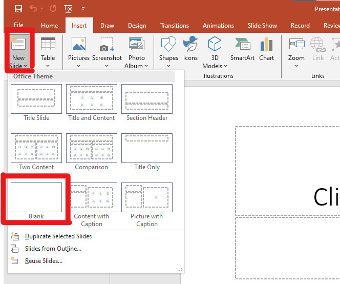
Insert a New Slide
Start by navigating to the slide where you want your Venn diagram.
- Open your PowerPoint presentation.
- Click on the slide where you want to insert the diagram.
- For best results, use a blank slide or a layout with enough space for visuals.
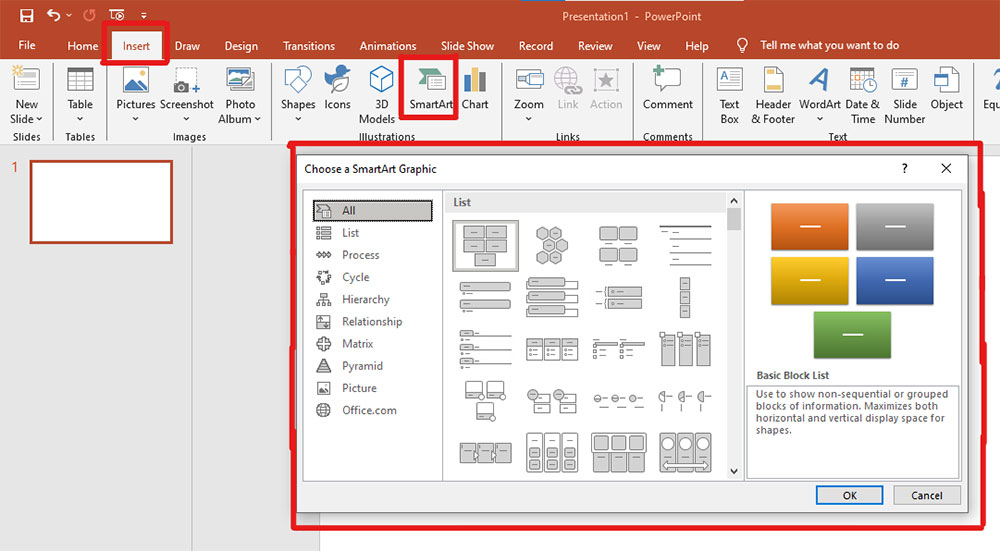
Access SmartArt Graphics
SmartArt offers a variety of diagram styles, including Venn diagrams.
- Click on the Insert tab in the top ribbon.
- Select SmartArt from the Illustrations group. This will open a gallery of diagram types.
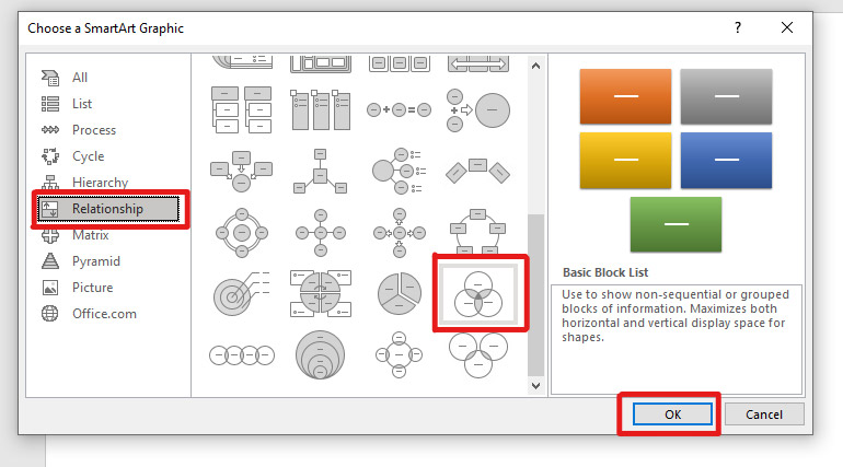
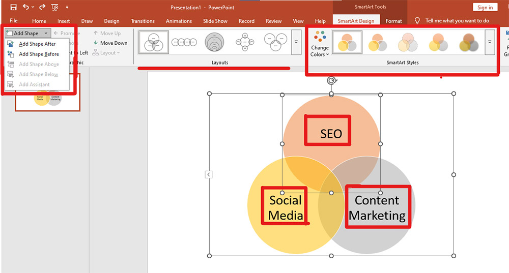
Choose a Venn Diagram Layout
To create a Venn diagram in PowerPoint using SmartArt, head to the “Relationship” category.
- In the SmartArt gallery, click on Relationship from the left panel.
- Scroll through the options and select Basic Venn.
- Click OK to insert the diagram into your slide.
This basic layout comes with three overlapping circles, enough for most standard comparisons. If you need more sets, you can add additional shapes manually.
Customize the Diagram
Once your Venn diagram in PowerPoint is inserted, it’s time to tailor it to your content.
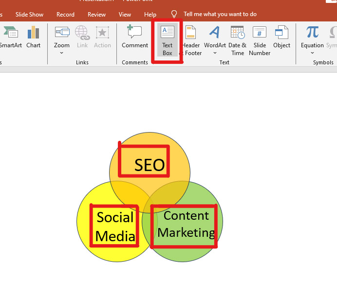
- Click on each circle to type in your categories, items, or concepts. (e.g. SEO, Social Media, Content Marketing, etc.)
- To add another circle, click on the diagram, go to the SmartArt Design tab, and choose Add Shape.
- Be careful not to overload the diagram with too many circles, it can become hard to read.
- Use Change Colors to match your Venn diagram with your overall slide theme.
- Apply SmartArt Styles if you want shadows, outlines, or 3D effects, but keep it clean and easy to understand.
Additional Tips for SmartArt:
Here are some additional tips to keep in mind when you make a Venn diagram in PowerPoint:
- Text length: Keep text inside circles short and precise. Too much text will clutter the diagram and confuse your audience.
- Editing text: You can use the text pane (toggle it via the arrow on the left of the SmartArt box) for easier editing of labels.
- Animations: Add simple entrance animations to each circle to reveal information step-by-step during your presentation.
- Limitations: SmartArt Venn diagrams are ideal for up to 3 sets. If you need more sets or unique shapes, this method might feel limiting.
Method 2: Manually Creating a Venn Diagram with Shapes
If you need more flexibility than what SmartArt offers, manually designing your Venn diagram in PowerPoint is the way to go. This method gives you full creative control, perfect for custom layouts, unique comparisons, or diagrams with more than three sets.
Follow these steps to build it from scratch:
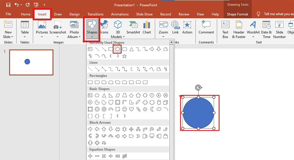
Insert Circles
To start, you’ll need to draw the circles that represent your sets:
- Click on the Insert tab in PowerPoint.
- Select Shapes, then choose the Oval shape.
- Hold down the Shift key while dragging your mouse to draw a perfect circle. This ensures symmetry across your diagram.
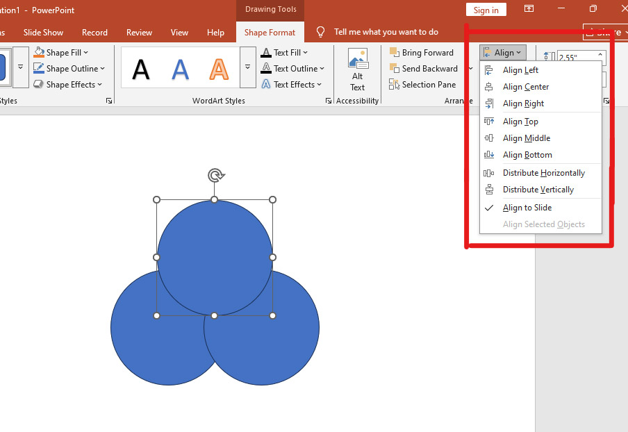
Duplicate and Position the Circles
Once your first circle is ready, make duplicates and place them to show the relationships:
- Select the circle, press Ctrl + C to copy, and Ctrl + V to paste as many circles as you need.
- Drag each circle so they overlap where necessary to illustrate intersections between sets.
- For precision, use your mouse or arrow keys to adjust the placement.
To align and space the circles perfectly:
- Go to the Format tab.
- Use Align Top, Align Middle, or Distribute Horizontally/Vertically to line them up evenly.
This makes your PowerPoint Venn diagram look clean and professional.
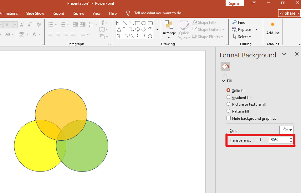
Adjust Transparency for Overlapping Areas
To make the overlapping parts of your Venn diagram PowerPoint visual clear and readable:
- Right-click on a circle and select Format Shape.
- In the Fill section, choose a solid color.
- Adjust the Transparency slider between 20% and 50%.
- Apply different fill colors for each circle so the overlaps stand out visually.
This transparency trick is key to helping your audience instantly understand the shared elements between sets.
Add Text Labels
Labeling your diagram helps it communicate your ideas clearly:
- Click on Insert > Text Box.
- Add text boxes inside each circle to label individual sets.
- Place smaller text boxes in the overlapping areas to describe shared characteristics or data points.
- Use bold headings, legible fonts, and appropriate sizes to make sure your text is easy to read without cluttering the diagram.
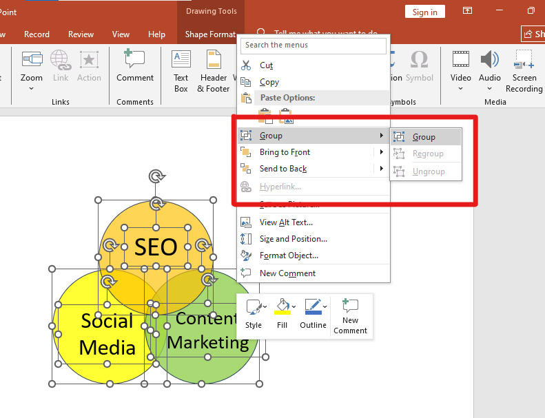
Group the Entire Diagram
Once everything is positioned and labeled:
- Select all circles and text boxes by holding Shift and clicking on each element.
- Right-click on any of the selected items and choose Group > Group.
This step keeps your Venn diagram in PowerPoint intact, so you can move or resize the entire diagram as a single object.
Additional Tips for Manual Method:
- Use Guides and Gridlines: Turn on guides (View > Guides) or gridlines to align circles more precisely.
- Layering: Use the Bring Forward or Send Backward options to layer circles and text correctly for better visibility.
- Color Coding: Choose meaningful colors (e.g., blue for tech, green for environment) that connect with your topic and audience.
- Custom Shapes: If you want a more unique look, try editing the shape outline or adding effects like shadows and reflections from the Format Shape pane.
- Save as Template: Once you create a Venn diagram you like, save that slide as a template for future presentations, saving you time.
Method 3: Using Venn Diagram Templates
Using a template is a quick, hassle-free way to get a polished PowerPoint Venn diagram, especially if you want a professional look without designing from scratch.
Download a Template
- Search for “Venn diagram PowerPoint templates” online.
- Pick one that suits your content and download it.
Insert the Template into Your Presentation
- Open the downloaded file.
- Copy the slide with the Venn diagram and paste it into your presentation.
Customize the Diagram
Edit the text, colors, and layout to match your style and message.
Wrap Up!
Now that you know how to make a Venn diagram in PowerPoint, creating clear, engaging visuals doesn’t have to be a struggle. Whether you use SmartArt, shapes, or templates, a well-designed Venn diagram can simplify complex ideas and keep your audience focused.
And if you’re short on time or want a polished, on-brand presentation, a professional PPT design service can help you create slides that truly stand out. Don’t just present information, make it visual, make it memorable, and make it count.
Author
Mr. Aijaz Mughal is a trusted advisor and thought leader in digital marketing and business growth with over 20 years of extensive experience. Throughout his illustrious career, he has had the privilege of working with top-tier brands such as Emaar, Masdar, Honda, Leejam, Unilever, The Dubai Mall, Emerson, Moorfields, and Yamaha, where he has made significant contributions to their digital marketing success.
Speak to an Expert